# SegmentedButton
**Repository Path**: juneor/SegmentedButton
## Basic Information
- **Project Name**: SegmentedButton
- **Description**: Segmented Control/Button with animation for Android API 16+
- **Primary Language**: Unknown
- **License**: Apache-2.0
- **Default Branch**: master
- **Homepage**: None
- **GVP Project**: No
## Statistics
- **Stars**: 0
- **Forks**: 0
- **Created**: 2026-03-06
- **Last Updated**: 2026-03-13
## Categories & Tags
**Categories**: Uncategorized
**Tags**: None
## README
[](https://android-arsenal.com/details/1/4445) [](https://jitpack.io/#addisonelliott/segmentedbutton)
# SegmentedButton
Android view that mimics iOS's [SegmentedControl](https://developer.apple.com/design/human-interface-guidelines/ios/controls/segmented-controls/)
## Features
* Customizable text color, size and font
* Custom button drawables
* Customizable button dividers
* Solid and dashed border support
* Ripple effect on button tap
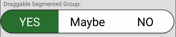
* Draggable buttons
* Animations
* Support for API 16+
## Old Library
This project is originally forked from [ceryle/SegmentedButton](https://github.com/ceryle/SegmentedButton) but has been revamped and given some TLC. The parent repository has been stagnant since **October 17th, 2017**.
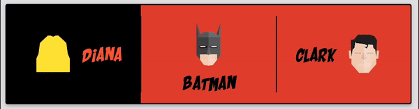
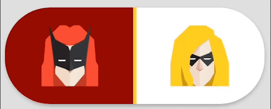
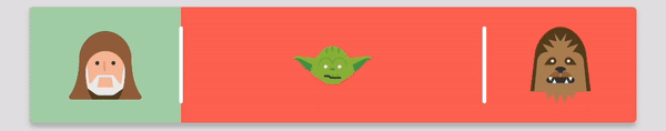
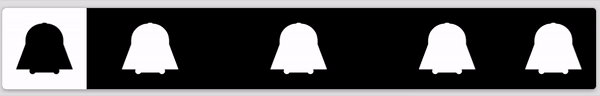
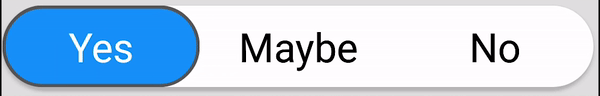
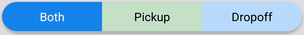
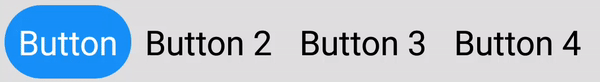
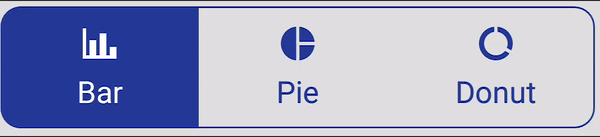
## Preview
[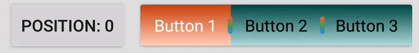](https://github.com/addisonElliott/SegmentedButton/blob/master/sample/src/main/res/layout/activity_main.xml#L26)
[](https://github.com/addisonElliott/SegmentedButton/blob/master/sample/src/main/res/layout/activity_main.xml#L91)
[](https://github.com/addisonElliott/SegmentedButton/blob/master/sample/src/main/res/layout/activity_main.xml#L147)
[](https://github.com/addisonElliott/SegmentedButton/blob/master/sample/src/main/res/layout/activity_main.xml#L216)
[](https://github.com/addisonElliott/SegmentedButton/blob/master/sample/src/main/res/layout/activity_main.xml#L253)
[](https://github.com/addisonElliott/SegmentedButton/blob/master/sample/src/main/res/layout/activity_main.xml#L285)
[](https://github.com/addisonElliott/SegmentedButton/blob/master/sample/src/main/res/layout/activity_main.xml#L334)
[](https://github.com/addisonElliott/SegmentedButton/blob/master/sample/src/main/res/layout/activity_main.xml#L399)
[](https://github.com/addisonElliott/SegmentedButton/blob/master/sample/src/main/res/layout/activity_main.xml#L583)
[](https://github.com/addisonElliott/SegmentedButton/blob/master/sample/src/main/res/layout/activity_main.xml#L459)
[](https://github.com/addisonElliott/SegmentedButton/blob/master/sample/src/main/res/layout/activity_main.xml#L498)
[](https://github.com/addisonElliott/SegmentedButton/blob/master/sample/src/main/res/layout/activity_main.xml#L634)
[](https://github.com/addisonElliott/SegmentedButton/blob/master/sample/src/main/res/layout/activity_main.xml#L690)
Code for all images can be found in the [sample project](https://github.com/addisonElliott/SegmentedButton/blob/master/sample/src/main/res/layout/activity_main.xml)
## Installation
#### Gradle
Add it to your build.gradle with:
```gradle
allprojects {
repositories {
maven { url "https://jitpack.io" }
}
}
```
and:
```gradle
dependencies {
implementation 'com.github.addisonelliott:SegmentedButton:$LATEST_VERSION'
}
```
**Note:** The `$LATEST_VERSION` string should be replaced with the latest version. The available versions can be found
here: https://jitpack.io/#addisonElliott/SegmentedButton
**Note:** This library uses the AndroidX packages rather than the older Android support libraries. Periodic releases
with the Android support library will be released based on user demand with the version appended with `-support` (e.g.
`3.1.2-support` for `$LATEST_VERSION`). It is strongly recommended to upgrade your project to AndroidX to obtain the
latest features & bug fixes.
**Note:** Java 8 is required to use this library. This can be done by adding the following code to `build.gradle` while
using the Android plugin with a version of `3.0.0` or higher.
```gradle
android {
compileOptions {
sourceCompatibility '1.8'
targetCompatibility '1.8'
}
}
```
## Usage
### Layout XML
```xml
```
### Java
```java
segmentedButtonGroup.setOnPositionChangedListener(new OnPositionChangedListener() {
@Override
public void onPositionChanged(final int position) {
// Handle stuff here
}
});
// Get current position
segmentedButtonGroup.getPosition();
```
Check out the [sample project](https://github.com/addisonElliott/SegmentedButton/blob/master/sample/src/main/res/layout/activity_main.xml) for additional examples
## Attributes
### SegmentedButtonGroup
| Attribute | Format | Description |
| ---------------------------------- | ----------------- | -------------------------------------------------------------------------- |
| android:background | `drawable\|color` | Set background for every button when unselected (default: transparent) |
| app:selectedBackground | `drawable\|color` | Set background for every button when selected (default: transparent) |
| app:borderWidth | `dimension` | Width of border around button group |
| app:borderColor | `color` | Color of border |
| app:borderDashWidth | `dimension` | Width of dashes, 0 indicates solid line |
| app:borderDashGap | `dimension` | Width of gaps in dashes |
| app:selectedBorderWidth | `dimension` | Width of border around selected button in group |
| app:selectedBorderColor | `color` | Color of border for selected button in group |
| app:selectedBorderDashWidth | `dimension` | Width of dashes for selected button in group, 0 indicates solid line |
| app:selectedBorderDashGap | `dimension` | Width of gaps in dashes for selected button in group |
| app:radius | `dimension` | Radius of corners for button group |
| app:selectedButtonRadius | `dimension` | Radius of corners for selected button in group |
| app:position | `integer` | Default button that is selected |
| app:draggable | `boolean` | Whether or not buttons can be dragged to change selected state |
| app:ripple | `boolean` | Whether or not ripple effect is enabled for all buttons |
| app:rippleColor | `color` | Ripple effect tint color for each button |
| app:divider | `drawable\|color` | Drawable or color to display for divider between buttons |
| app:dividerWidth | `dimension` | Width of the divider between buttons, 0 indicates no dividers |
| app:dividerRadius | `dimension` | Corner radius for divider to round edges |
| app:dividerPadding | `dimension` | Divider padding on top and bottom of divider |
| app:selectionAnimationDuration | `integer` | Duration in ms for change button selection animation |
| app:selectionAnimationInterpolator | `enum` | Type of animation used for changing button. Valid options are listed below |
### SegmentedButton
| Option Name | Format | Description |
| ------------------------------- | ----------------- | ---------------------------------------------------------------------------- |
| android:background | `drawable\|color` | Set background for button when unselected (default: transparent) |
| app:selectedBackground | `drawable\|color` | Set background for button when selected (default: transparent) |
| app:rounded | `boolean` | Whether or not the button is rounded.
**Note:** This is used to round **BOTH** sides of a button. The typical use case is for rounded buttons with a transparent background. |
| app:rippleColor | `color` | Ripple effect tint color when user taps on button |
| app:drawable | `drawable` | Drawable to display |
| app:drawablePadding | `dimension` | Padding between drawable and text |
| app:drawableTint | `color` | Tint color for drawable when unselected |
| app:selectedDrawableTint | `color` | Tint color for drawable when selected |
| app:drawableWidth | `dimension` | Width of drawable (default uses intrinsic) |
| app:drawableHeight | `dimension` | Height of drawable (default uses intrinsic) |
| app:drawableGravity | `enum` | Determines where drawable should be placed in relation to the text. Valid options are `Gravity.LEFT`, `Gravity.TOP`, `Gravity.RIGHT`, and `Gravity.BOTTOM` |
| app:text | `string` | Text to display on button |
| app:textColor | `color` | Color of text when button is unselected |
| app:selectedTextColor | `color` | Color of text when button is selected |
| app:textSize | `dimension` | Font size of text |
| android:fontFamily | `font` | Font for displaying text |
| app:textStyle | `flag` | Text style, can be `Typeface.NORMAL`, `Typeface.BOLD`, and `Typeface.ITALIC` |
| app:selectedTextStyle | `flag` | Selected text style, can be `Typeface.NORMAL`, `Typeface.BOLD`, and `Typeface.ITALIC`
| app:linesCount | `int` | Maximum lines count, multiline by default, works with not-none ellipsize type|
| android:ellipsize | `enum` | Ellipsize type, can be `none`, `start`, `middle`, `end`, `marquee`, none by default
**All layout attributes have a corresponding function in Java that can be called to change programatically. See Javadocs of source code for more information.**
### Available Animations
- fastOutSlowIn
- bounce
- linear
- decelerate
- cycle
- anticipate
- accelerateDecelerate
- accelerate
- anticipateOvershoot
- fastOutLinearIn
- linearOutSlowIn
- overshoot
These animations can be set using the attribute noted above like so: `app:selectionAnimationInterpolator="bounce"`.
## Support
Issues and pull requests are encouraged.
## License
This project is licensed under the Apache License Version 2.0 - see the [LICENSE](LICENSE) file for details
```
Copyright (C) 2016 ceryle
Copyright (C) 2019 Addison Elliott
Licensed under the Apache License, Version 2.0 (the "License");
you may not use this file except in compliance with the License.
You may obtain a copy of the License at
http://www.apache.org/licenses/LICENSE-2.0
Unless required by applicable law or agreed to in writing, software
distributed under the License is distributed on an "AS IS" BASIS,
WITHOUT WARRANTIES OR CONDITIONS OF ANY KIND, either express or implied.
See the License for the specific language governing permissions and
limitations under the License.
```