# react-trello
**Repository Path**: trusted-list/react-trello
## Basic Information
- **Project Name**: react-trello
- **Description**: Pluggable components to add a kanban board to your application
- **Primary Language**: Unknown
- **License**: MIT
- **Default Branch**: master
- **Homepage**: https://rcdexta.com/react-trello/
- **GVP Project**: No
## Statistics
- **Stars**: 0
- **Forks**: 0
- **Created**: 2026-03-18
- **Last Updated**: 2026-04-12
## Categories & Tags
**Categories**: Uncategorized
**Tags**: None
## README
# React Trello
Pluggable components to add a Trello (like) kanban board to your application
[](https://travis-ci.org/rcdexta/react-trello)
[](https://badge.fury.io/js/react-trello)
[](https://bundlephobia.com/result?p=react-trello)
> This library is not affiliated, associated, authorized, endorsed by or in any way officially connected to Trello, Inc. `Trello` is a registered trademark of Atlassian, Inc.
#### Basic Demo
[](https://codesandbox.io/s/1o3zj95m9j)
#### Features Showcase
[Storybook](https://rcdexta.github.io/react-trello/)
## Features
* Responsive and extensible
* Easily pluggable into existing react application
* Supports pagination when scrolling individual lanes
* Drag-And-Drop on cards and lanes (compatible with touch devices)
* Edit functionality to add/delete cards
* Custom elements to define lane and card appearance
* Event bus for triggering events externally (e.g.: adding or removing cards based on events coming from backend)
* Inline edit lane's title
## Getting Started
Install using npm or yarn
```bash
$ npm install --save react-trello
```
or
```bash
$ yarn add react-trello
```
## Usage
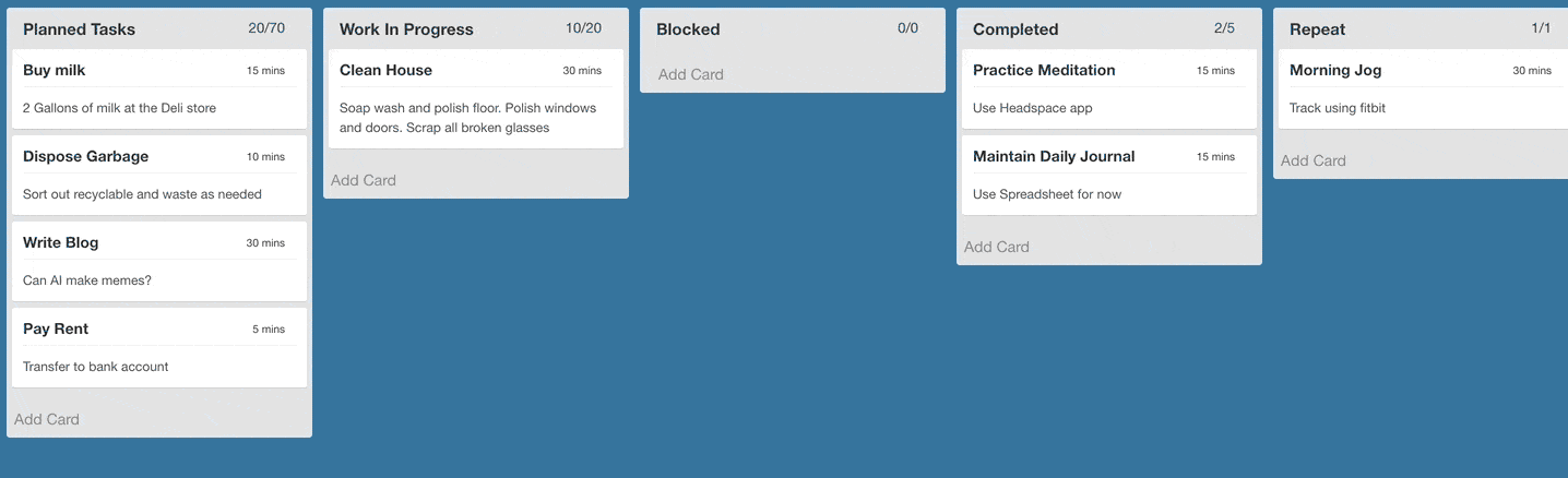
The `Board` component takes a prop called `data` that contains all the details related to rendering the board. A sample data json is given here to illustrate the contract:
```javascript
const data = {
lanes: [
{
id: 'lane1',
title: 'Planned Tasks',
label: '2/2',
cards: [
{id: 'Card1', title: 'Write Blog', description: 'Can AI make memes', label: '30 mins', draggable: false},
{id: 'Card2', title: 'Pay Rent', description: 'Transfer via NEFT', label: '5 mins', metadata: {sha: 'be312a1'}}
]
},
{
id: 'lane2',
title: 'Completed',
label: '0/0',
cards: []
}
]
}
```
`draggable` property of Card object is `true` by default.
The data is passed to the board component and that's it.
```jsx
import React from 'react'
import Board from 'react-trello'
export default class App extends React.Component {
render() {
return
}
}
```
Refer to storybook for detailed examples: https://rcdexta.github.io/react-trello/
Also refer to the sample project that uses react-trello as illustration: https://github.com/rcdexta/react-trello-example
## Use edge version of project (current master branch)
```bash
$ yarn add rcdexta/react-trello
```
and
```javascript
import Board from 'react-trello/src'
```
## Upgrade
Breaking changes. Since version 2.2 these properties are removed: `addLaneTitle`, `addCardLink`, `customLaneHeader`, `newCardTemplate`, `newLaneTemplate`,
and `customCardLayout` with `children` element.
Follow [upgrade instructions](UPGRADE.md) to make easy migration.
## Properties
This is the container component that encapsulates the lanes and cards
### Required parameters
| Name | Type | Description |
| ------------------- | -------- | ------------------------------------------------------------------------------------------------------------------------------ |
| data | object | Actual board data in the form of json |
### Optionable flags
| Name | Type | Description |
| ------------------- | -------- | ------------------------------------------------------------------------------------------------------------------------------ |
| draggable | boolean | Makes all cards and lanes draggable. Default: false |
| laneDraggable | boolean | Set to false to disable lane dragging. Default: true |
| cardDraggable | boolean | Set to false to disable card dragging. Default: true |
| collapsibleLanes | boolean | Make the lanes with cards collapsible. Default: false |
| editable | boolean | Makes the entire board editable. Allow cards to be added or deleted Default: false |
| canAddLanes | boolean | Allows new lanes to be added to the board. Default: false |
| hideCardDeleteIcon | boolean | Disable showing the delete icon to the top right corner of the card (when board is editable) |
| editLaneTitle | boolean | Allow inline lane title edit Default: false |
### Callbacks and handlers
| Name | Type | Description |
| ------------------- | -------- | ------------------------------------------------------------------------------------------------------------------------------ |
| handleDragStart | function | Callback function triggered when card drag is started: `handleDragStart(cardId, laneId)` |
| handleDragEnd | function | Callback function triggered when card drag ends, return false if you want to cancel drop: `handleDragEnd(cardId, sourceLaneId, targetLaneId, position, cardDetails)` |
| handleLaneDragStart | function | Callback function triggered when lane drag is started: `handleLaneDragStart(laneId)` |
| handleLaneDragEnd | function | Callback function triggered when lane drag ends: `handleLaneDragEnd(removedIndex, addedIndex, payload)` |
| onDataChange | function | Called everytime the data changes due to user interaction or event bus: `onDataChange(newData)` |
| onCardClick | function | Called when a card is clicked: `onCardClick(cardId, metadata, laneId)` |
| onCardAdd | function | Called when a new card is added: `onCardAdd(card, laneId)` |
| onBeforeCardDelete | function | Called before delete a card, please call the `callback()` if confirm to delete a card: `onConfirmCardDelete(callback)`
| onCardDelete | function | Called when a card is deleted: `onCardDelete(cardId, laneId)` |
| onCardMoveAcrossLanes | function | Called when a card is moved across lanes `onCardMoveAcrossLanes(fromLaneId, toLaneId, cardId, index)` |
| onLaneAdd | function | Called when a new lane is added: `onLaneAdd(params)` |
| onLaneDelete | function | Called when a lane is deleted `onLaneDelete(laneId)` |
| onLaneUpdate | function | Called when a lane attributes are updated `onLaneUpdate(laneId, data)` |
| onLaneClick | function | Called when a lane is clicked `onLaneClick(laneId)`. Card clicks are not propagated to lane click event |
| onLaneScroll | function | Called when a lane is scrolled to the end: `onLaneScroll(requestedPage, laneId)` |
### Other functions
| Name | Type | Description |
| ------------------- | -------- | ------------------------------------------------------------------------------------------------------------------------------ |
| eventBusHandle | function | This is a special function that providers a publishHook to pass new events to the board. See details in Publish Events section |
| laneSortFunction | function | Used to specify the logic to sort cards on a lane: `laneSortFunction(card1, card2)` |
### I18n support
| Name | Type | Description |
| ------------------- | -------- | ------------------------------------------------------------------------------------------------------------------------------ |
| lang | string | Language of compiled texts ("en", "ru", "pt-br"). Default is "en" |
| t | function | Translation function. You can specify either one key as a `String`. Look into ./src/locales for keys list |
### Style customization
| Name | Type | Description |
| ------------------- | -------- | ------------------------------------------------------------------------------------------------------------------------------ |
| style | object | Pass CSS style props to board container |
| cardStyle | object | CSS style for every cards |
| laneStyle | object | CSS style for every lanes |
| tagStyle | object | If cards have tags, use this prop to modify their style |
| cardDragClass | string | CSS class to be applied to Card when being dragged |
| cardDropClass | string | CSS class to be applied to Card when being dropped |
| laneDragClass | string | CSS class to be applied to Lane when being dragged |
| laneDropClass | string | CSS class to be applied to Lane when being dropped |
| components | object | Map of customised components. [List](src/components/index.js) of available. |
### Lane specific props
| Name | Type | Description |
| ------------------- | -------- | ------------------------------------------------------------------------------------------------------------------------------ |
| id | string | ID of lane |
| style | object | Pass CSS style props to lane container |
| labelStyle | object | Pass CSS style props of label |
| cardStyle | object | Pass CSS style props for cards in this lane |
| disallowAddingCard | boolean | Disallow adding card button in this lane (default: false) |
Refer to `stories` folder for examples on many more options for customization.
## Editable Board
It is possible to make the entire board editable by setting the `editable` prop to true. This switch prop will enable existing cards to be deleted and show a `Add Card` link at the bottom of each lane, clicking which will show an inline editable new card.
Check out the [editable board story](https://rcdexta.github.io/react-trello/?selectedKind=Editable%20Board&selectedStory=Add%2FDelete%20Cards&full=0&down=0&left=1&panelRight=0) and its corresponding [source code](https://github.com/rcdexta/react-trello/blob/master/stories/EditableBoard.story.js) for more details.
## Styling and customization
There are three ways to apply styles to the library components including `Board`, `Lane` or `Card`:
### 1. Predefined CSS classnames
Use the predefined css classnames attached to these elements that go by `.react-trello-lane`, `.react-trello-card`, `.react-trello-board`:
```css
.react-trello-lane {
border: 0;
background-color: initial;
}
```
### 2. Pass custom style attributes as part of data.
This method depends on used `Card` and `Lane` components.
```javascript
const data = {
lanes: [
{
id: 'lane1',
title: 'Planned Tasks',
style: { backgroundColor: 'yellow' }, // Style of Lane
cardStyle: { backgroundColor: 'blue' } // Style of Card
...
};
```
Storybook example - [stories/Styling.story.js](stories/Styling.story.js)
### 3. Completely customize the look-and-feel by using components dependency injection.
You can override any of used components (ether one or completery all)
```javascript
const components = {
GlobalStyle: MyGlobalStyle, // global style created with method `createGlobalStyle` of `styled-components`
LaneHeader: MyLaneHeader,
Card: MyCard,
AddCardLink: MyAddCardLink,
...
};
```
Total list of customizable components: [src/components/index.js ](src/components/index.js)
Refer to [components definitions](src/components) to discover their properties list and types.
Refer more examples in storybook.
## Publish Events
When defining the board, it is possible to obtain a event hook to the component to publish new events later after the board has been rendered. Refer the example below:
```javascript
let eventBus = undefined
const setEventBus = (handle) => {
eventBus = handle
}
//To add a card
eventBus.publish({type: 'ADD_CARD', laneId: 'COMPLETED', card: {id: "M1", title: "Buy Milk", label: "15 mins", description: "Also set reminder"}})
//To update a card
eventBus.publish({type: 'UPDATE_CARD', laneId: 'COMPLETED', card: {id: "M1", title: "Buy Milk (Updated)", label: "20 mins", description: "Also set reminder (Updated)"}})
//To remove a card
eventBus.publish({type: 'REMOVE_CARD', laneId: 'PLANNED', cardId: "M1"})
//To move a card from one lane to another. index specifies the position to move the card to in the target lane
eventBus.publish({type: 'MOVE_CARD', fromLaneId: 'PLANNED', toLaneId: 'WIP', cardId: 'Plan3', index: 0})
//To update the lanes
eventBus.publish({type: 'UPDATE_LANES', lanes: newLaneData})
```
The first event in the above example will move the card `Buy Milk` from the planned lane to completed lane. We expect that this library can be wired to a backend push api that can alter the state of the board in realtime.
## I18n and text translations
### Custom text translation function
Pass translation function to provide custom or localized texts:
```javascript
// If your translation table is flat
//
// For example: { 'placeholder.title': 'some text' }
const customTranslation = (key) => TRANSLATION_TABLE[key]
// If your translation table has nested hashes (provided translations table is it)
//
// For example: { 'placeholder': { 'title': 'some text' } }
import { createTranslate } from 'react-trello'
const customTranslation = createTranslate(TRANSLATION_TABLE)
```
List of available keys - [locales/en/translation.json](https://github.com/rcdexta/react-trello/blob/master/locales/en/translation.json)
### react-i18next example
```javascript
import { withTranslation } from 'react-i18next';
const I18nBoard = withTranslation()(Board)
```
## Compatible Browsers
Tested to work with following browsers using [Browserling](https://www.browserling.com/):
* Chrome 60 or above
* Firefox 52 or above
* Opera 51 or above
* Safari 4.0 or above
* Microsoft Edge 15 or above
## Logging
Pass environment variable `REDUX_LOGGING` as true to enable Redux logging in any environment
## Development
```
cd react-trello/
yarn install
yarn run storybook
```
### Scripts
1. `yarn run lint` : Lint all js files
2. `yarn run lintfix` : fix linting errors of all js files
3. `yarn run semantic-release` : make a release. Leave it for CI to do.
4. `yarn run storybook`: Start developing by using storybook
5. `yarn run test` : Run tests. tests file should be written as `*.test.js` and using ES2015
6. `yarn run test:watch` : Watch tests while writing
7. `yarn run test:cover` : Show coverage report of your tests
8. `yarn run test:report` : Report test coverage to codecov.io. Leave this for CI
9. `yarn run build`: transpile all ES6 component files into ES5(commonjs) and put it in `dist` directory
10. `yarn run docs`: create static build of storybook in `docs` directory that can be used for github pages
Learn how to write stories [here](https://storybook.js.org/basics/writing-stories/)
### Maintainers

rcdexta
|

dapi
|
### License
MIT